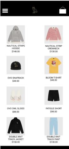
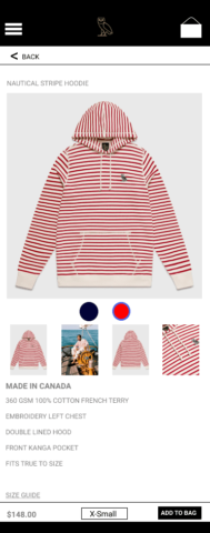
The Problem
This project was used for an individual assignment for school where I was tasked with redesigning the user experience for an app. I chose this app because I already had it on my phone and have had trouble using it in the past.
What I did
To begin, I used the app as if I was going to purchase something and wrote down my pain points. For this assignment, I focused mainly on the navigation and the product screen where the user finds what clothing they want. The listings were small, and seeing the pictures clearly was difficult. The app also listed each item for every different color it had, rather than grouping them all together. Next, I went to other retail websites like Amazon and JCPenney to see how they listed their items and kept note of it, I also looked at other companies similar to OVO (think: Supreme), but found that they had similar problems as well. Next, I started wireframing on Figma and eventually it turned into a very basic prototype. This was one of my very first user experience projects, and as I learn more I will come back and update it. My hope is to eventually send it to the creators of the OVO app.
The Results
Skills Showcased:
Prototyping, Problem Solving, Competitive Analysis


